
-
Web design has never been one of my strong points, and it’s something I’d like to improve on.
-
The Roy on Magic blog has been using the default WordPress Template since forever, and I’ve been trying to find a good WP Template that fits the “Magic the Gathering” theme.
Put the above points together, and I have a new personal project. Just for fun, I’ll log my progress here.
Where do I start? I’m actually pretty clueless about web design in general, but I figure I can rough it out. I decide that I need to start by choosing colors. Yes, websites have colors, and despite the fact that I couldn’t figure out matching shirts and pants to save my life, I’m going to try to pick a decent color scheme for a website.
Except I didn’t. I cheated instead. I knew that Excel 2007 came with predefined sets of color themes, so I fired up Excel and chose from one of the available color schemes.
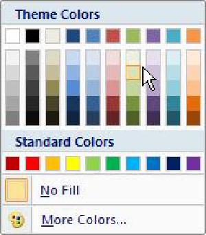
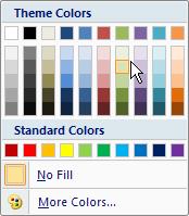
I figure it’s okay to cheat here and there because I’m a newb. Excel 2007 offers me several color schemes; since my favorite color in Magic is green, I decide it’s going to be a green-themed website layout and choose the colors from the default green-type theme.
I think about how I would layout the page. I could open up an HTML editor and draft a few sample layouts, but instead I do something a bit easier. I already have Excel open, so I draft the layout using Excel. We sometimes use Excel at work for prototyping web forms; using it to prototype layouts isn’t so far a stretch. I decide on a 3-column layout with varying shades of green and put in some sample text of what I imagine each column would contain.
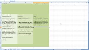
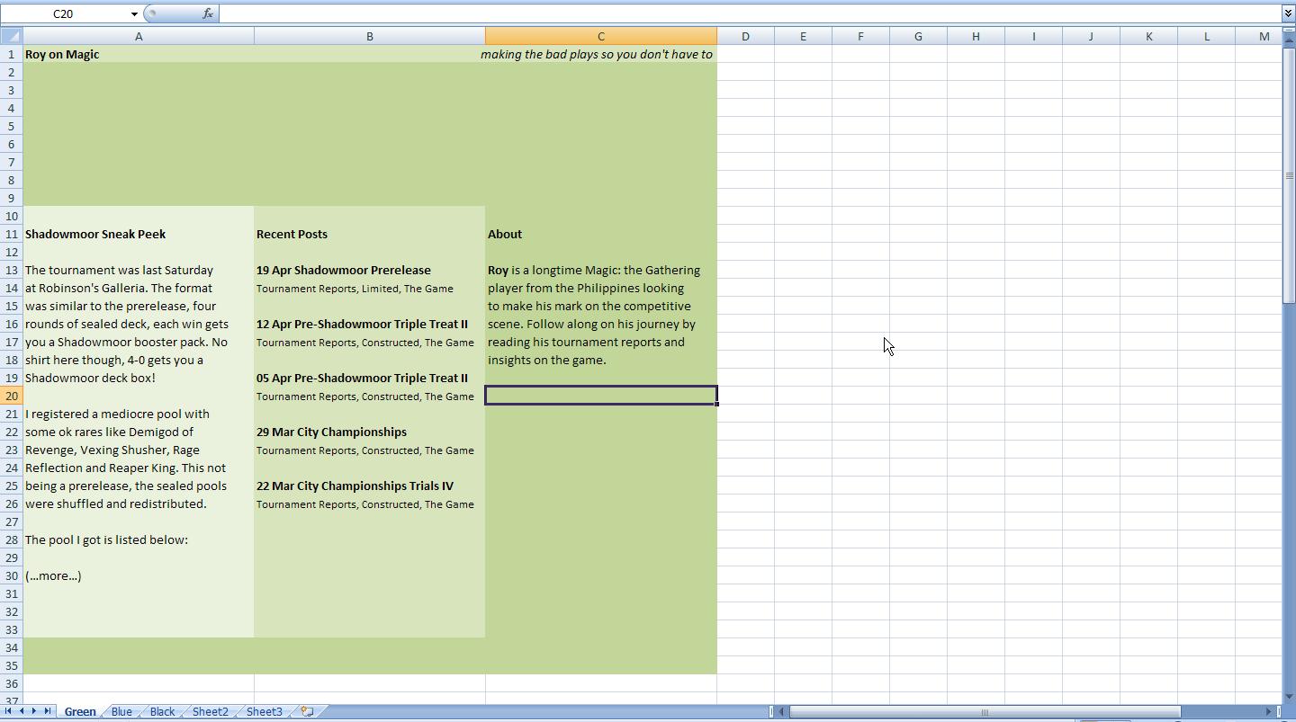
When a reader comes to the site, I want him to read the most recent article first, so I place the latest post content in the leftmost column. I imagine that I can figure out later how to make only one post appear there. After the most recent article, I want the user to see a list of the recent posts, so I put in the second column where he can quickly scan it. In the last column I’ll place the “About” stuff, etc.
Next, I open up a text editor. I know that most “pro” web designers recommend the use of CSS for layouts so I try out the 3-column layout, using 3 floating divs inside a container div. It looks fine in Firefox, but it doesn’t look so hot in IE. (See screenshot for details)
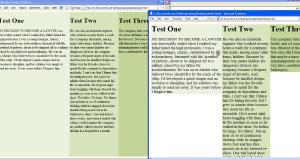
If I had more time, I would’ve looked up how to fix this using CSS, but I was impatient and still had the “newb” excuse so I just made a mockup page using a table layout instead. [TODO: Screenshot]
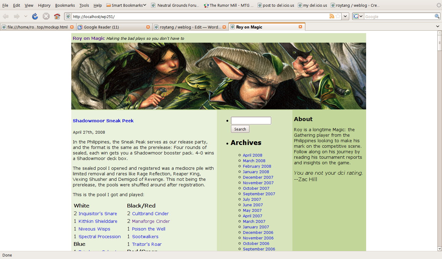
Next I need an image to place in the header area, preferably artwork from a green Magic card. The best place to look is the official website, so I browse over to MagicTheGathering.com and look over the recent entries in the “Wallpaper of the Week” feature. I settle on the card art for Winnower Patrol.
I download the 1280×1024 version of the wallpaper and open it up in the Gimp Image Editor. I crop a smaller area that matches the header size and paste it unto an image of my mockup to get a feel of what it looks like.
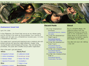
The Winnower Patrol image fits surprisingly well, at least it looks that way to me.
Now that I have a rough layout, I want to start working on the WordPress side. I already have a local WordPress installation, so to make things easier I export the content of the Roy on Magic site and import it into my local test installation.
Next I go into my local wordpress folder and create a copy of the default theme. I name the new folder “green” – I’ll think of a creative name for the theme later.
I go into the folder and wonder where I should start. I’m a bit familiar already with the files so I know that to create the basic layout I have to modify the ff:
a. styles.css – I delete the contents and paste in the styles from my HTML mockup
b. header.php – similarly, I copy-paste the header code from my HTML mockup into the header file. Additionally, I have to change the hardcoded “Roy on Magic” to and the description to
c. index.php – this is the page that renders the posts. I’m not yet too familiar with how WP does the post retrieval, so I just copy the table row from the HTML mockup and then put in the default post generation code.
d. sidebar.php – similar to index, I just copy the default sidebar content first and place it inside the HTML mockup tags. I also paste the third column contents from the mockup into the currently empty third column.
e. footer.php – similarly merged from mockup and the default template.
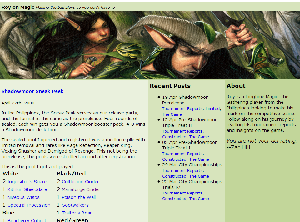
I login to WordPress and change the theme to “green” and check it out in the browser:
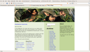
It now looks like the layout I planned! (Surprise!) Now I need to cleanup the content so that only the parts I want are displayed in each column. This is going to take a lot more delving into the innards of WordPress and PHP though, so I’ll continue this next time.
See Also