During recent weeknotes I’ve mentioned that I’ve been working on a site redesign. The planned redesign had three objectives, more or less:
- Rework the navigation links so that new pages like the blogroll etc were more easily accessible.
- Make the homepage less messy and highlight blog posts more. The previous “stream of everything” home page mixed the blog posts in with everything else like the notes, and photos and links.
- General redesign to improve the layout etc.
I had already done most of #1 and #2 (easy), but during the past few days, I found it difficult to decide on a direction for #3. (This is what happens when you set a vague goal.) It didn’t help that I found myself browsing Tumblr themes in the early mornings after recently having to debug Tumblr stuff. I don’t consider myself especially good at web design, but I do enjoy browsing themes, whether it’s Wordpress or Tumblr or Hugo themes. This is the reason why even when I was using Wordpress, I would be switching themes way too often. I’m not one of those guys who can be happy running the same Blogspot template for ten years. Given all of that I don’t know if the redesign would ever finish if I insisted on a general redesign. So, I’m deploying #1 and #2 first, and maybe worry about the other stuff in the future. So: more incremental, less big, drastic change, I find that always works out better.
We do get some general changes:
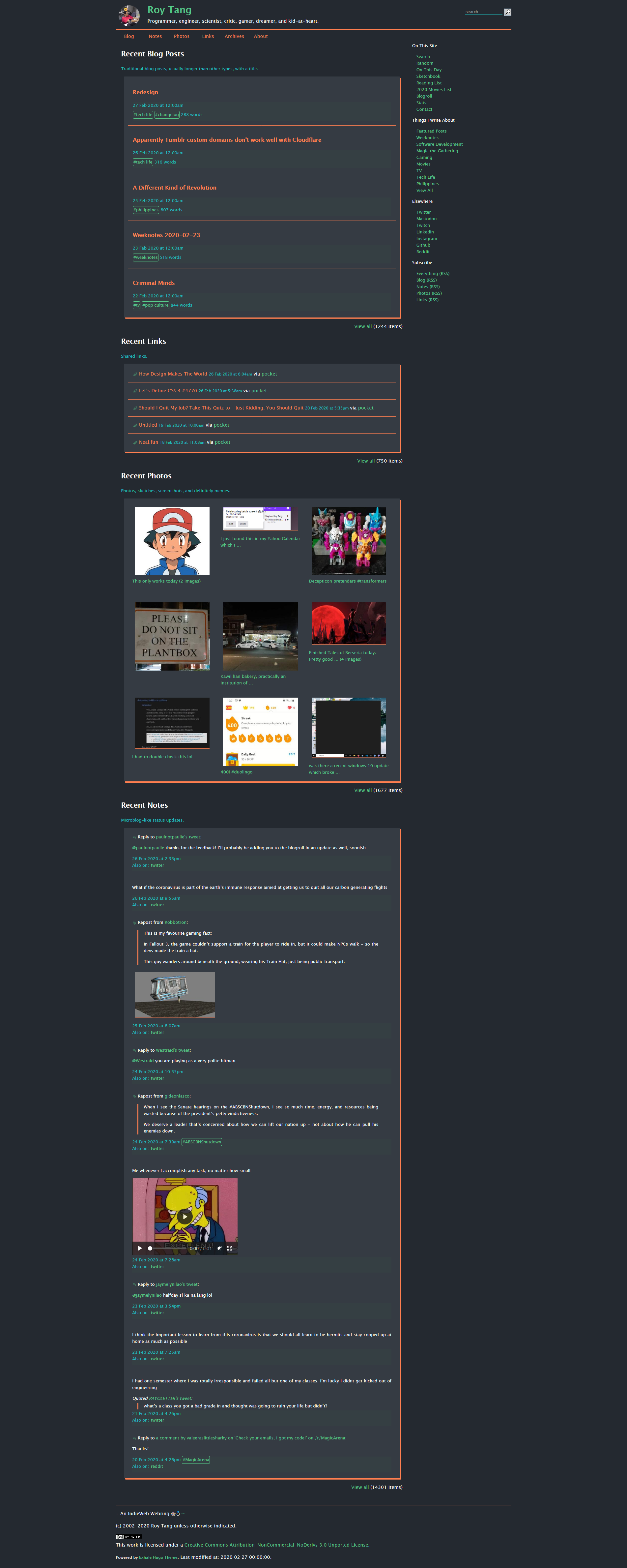
- sidebar added for the navigation links, replacing the previous hero section at the top of the pages. The sidebar ploops to the bottom on lower display widths. Main links still up top.
- tightening up the spacing in the header
- Menus and Home page summary lists externalized to JSON data files
Probably some kinks to work out here and there since I decided to cut the cord on the redesign abruptly, but should be nothing we can’t fix as needed.
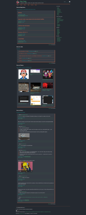
As is tradition for changelog posts, I’m attaching a screenshot of the new design here. And I just discovered right now that the latest Firefox has built-in functionality for taking a screenshot of the whole page. No more need for Fireshot!


See Also