Over the past couple of weeks or so, I’ve made quite a few changes to the site, mostly focused on frontend/layout/UI changes. The changes are more or less done, so here’s a changelog entry.
The main driver of the changes was this post about best practices for text websites. Not all of it applies to the site, since I do have a bunch of image content around as well, but enough that I was spurred to apply many of the points and also include some additional changes I’ve been meaning to do. Secondary objectives include: improving site performance, accessibility, and code output; and hopefully making the site menus more organized.
Layout changes:
- Simplified top header content. V-card and some other stuff moved to the footer. Merged “Blog”, “Notes” and “Links” into “Posts” for shorter menu.
- Removed sidebar. Most of the sidebar links for my own use/benefit anyway, and not for the potential blog reader. Most of the content has been moved into the home page, footer, and the new explore page.
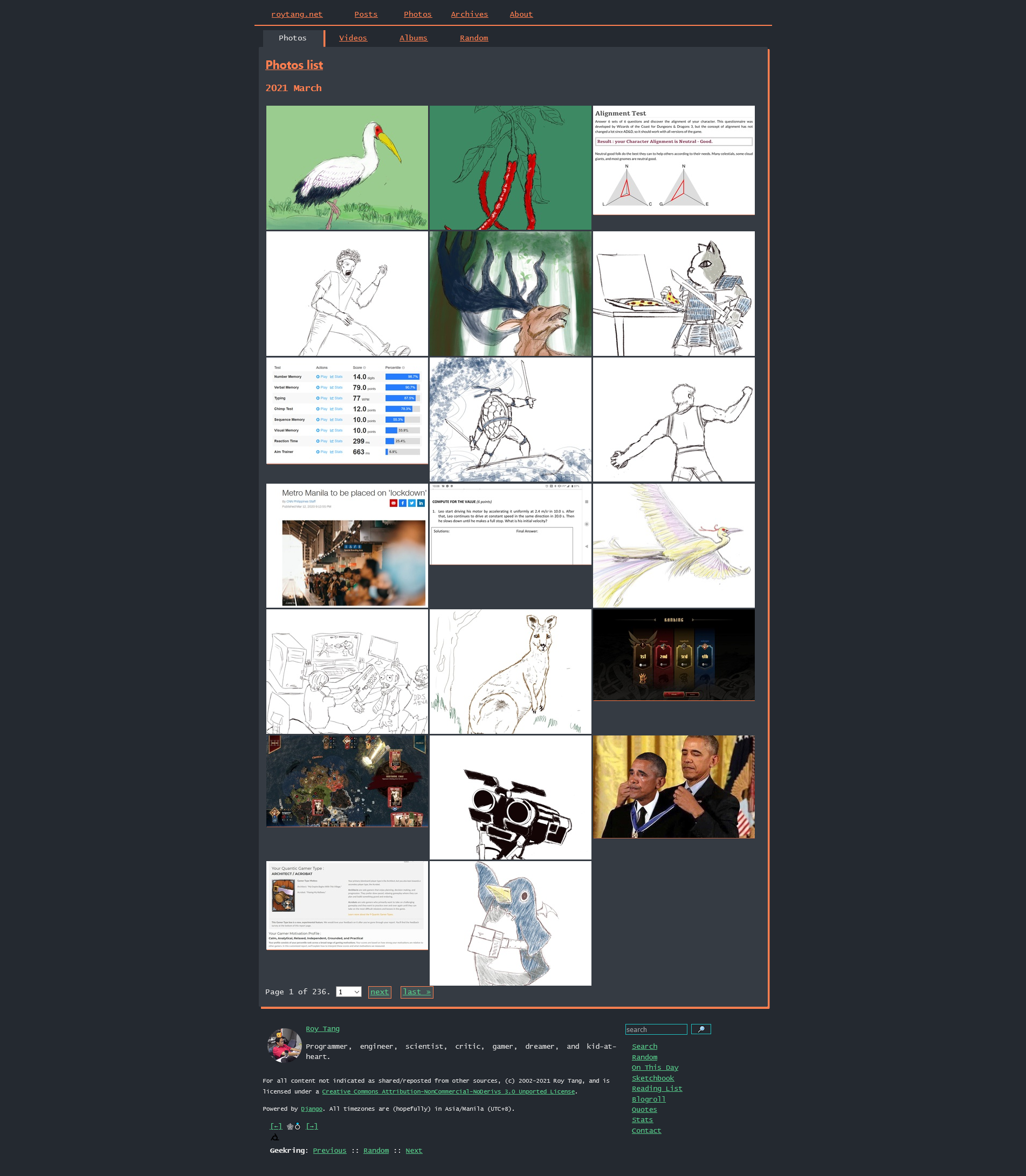
- Added submenus to most listing pages.
- Standardize display of page title/description where possible
- Added support for “prefers-color-scheme: light”. I still default to dark mode though!
- Switched to a monospace font. Honestly I find it hard to decide whether I like monospace or sans-serif more, but let’s go with this for now.
- Cleaned up/reduced the meta info at the bottom of each post.
Client-side performance:
- full-size images are now set to lazy load, so the browser doesn’t have to download them all immediately for example when viewing an album. Only the thumbnails are loaded immediately, full-size images are shown only when activating the lightbox.
- featured image for blog posts now use a thumbnail when shown in list view.
- I also wanted to improve the WebBloat score. It’s currently fine for text-heavy blog posts, but I guess I can’t avoid a higher score for image-heavy content since the crawler they use ignores the fact that I lazy load the full-size images and they are initially hidden. Something to consider in the future.
Content changes:
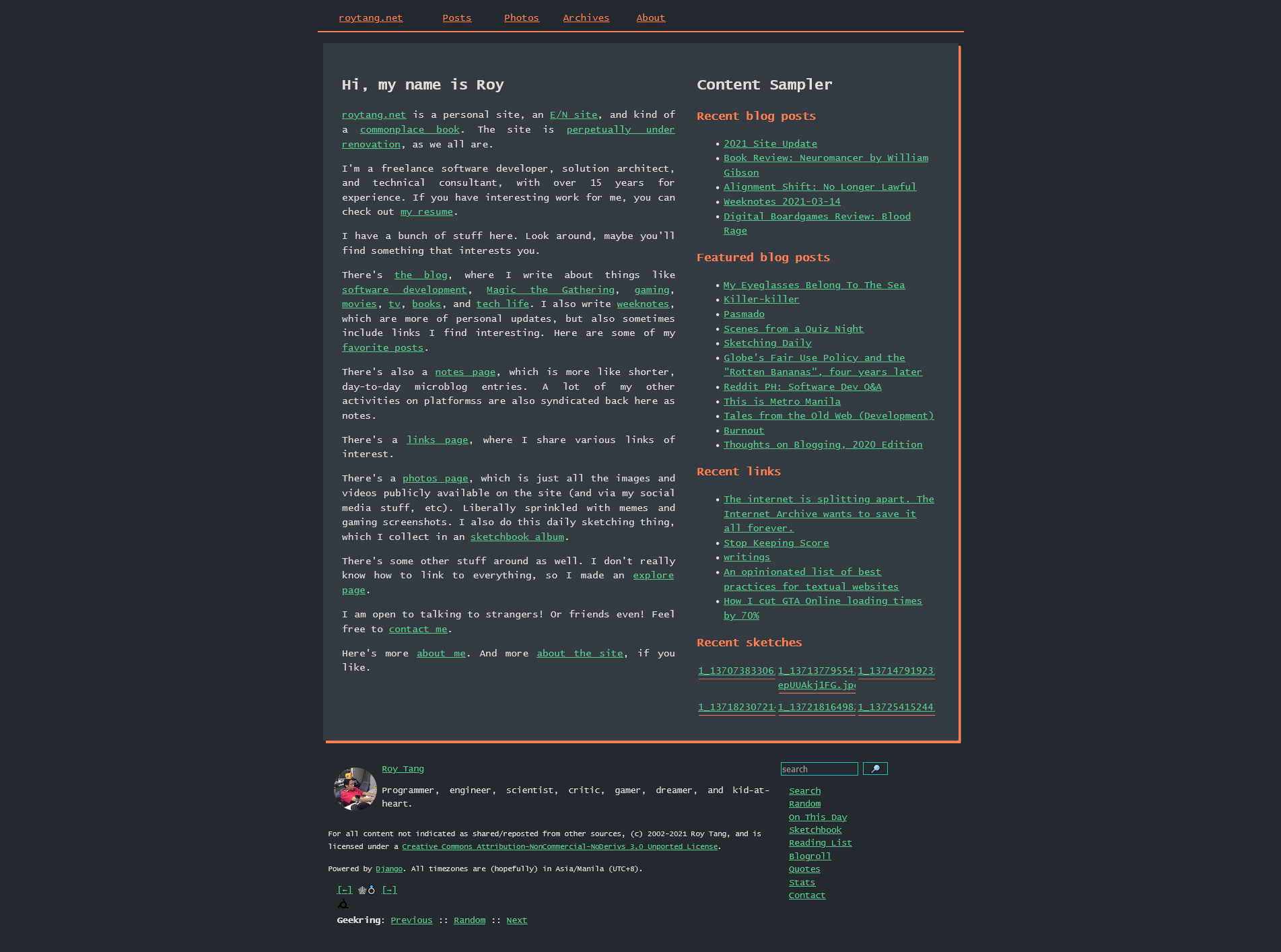
- new front/home page with content samplers
- added “Explore” page where I can put links that don’t belong in any of the submenus
- improved “Now” page
- cleaned up some out of date stuff in the About pages
- use profile photo as favicon
Backend/code changes:
- HTML Validation: Most pages should now validate without warnings/errors on the W3C HTML validator. There was actually a lot of broken HTML I had to fix (due to me mistyping things and so on.)
- Made sure most images had alt-text, even if just default values.
- Score of 75/100 on the Mozilla Observatory. It was at 20/100 before. The only thing I hadn’t implemented yet was the Content Security Policy (CSP) header, as it would have caused some issues on certain pages.
- I also tried to generally reduce the page weight, but it wasn’t actually that high before, so I don’t think there’s any measurable change there. Minifying HTML/CSS was a possibility, but that just makes it harder for me to debug things, and really feels like something too serious for a hobby site like this.
Scripts and cookies:
- the site already uses minimal JS in a few places: there’s a captcha for comments, and the locations page requires JS, and some of the stat pages load data remotely via JS, but that should be it. 99% of the pages of the site should be JS free.
- I also don’t use any cookies myself. But I do have Cloudflare enabled on the site, and they do add a
__cfduidcookie, supposedly to detect bots. This cookie is being deprecated by May 2021 though, so by then the site should be cookie-free.
That should be it! I had some other features in mind to implement (never ending scope creep when you have a personal project really), but I’ve already spent too much time on this and need to work on my other shenanigans as well.
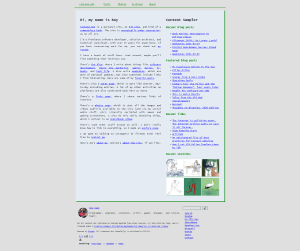
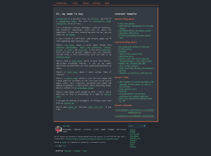
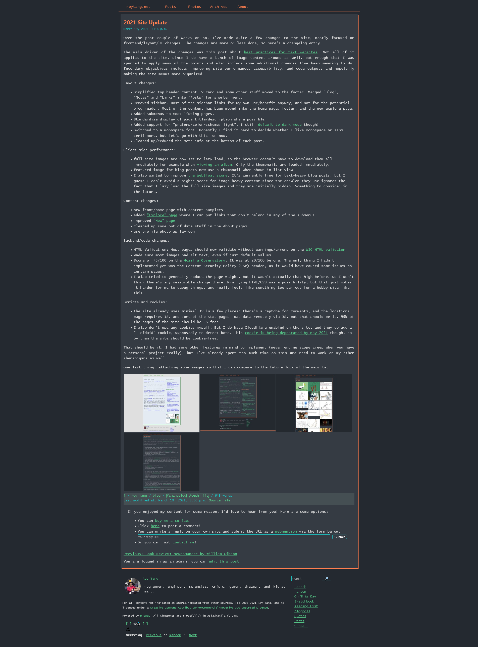
One last thing: attaching some images so that I can compare to the future look of the website:




See Also